We launched a refreshed look for Fastmail, with a new logo, app icon, colors, and website.
Fastmail launched in 1999 for people in-the-know about email. Twenty years later, we’re reaching a broader audience than ever before. People care about their time and privacy, and they understand that the choices they make, and the products they use, matter.
Our new look celebrates our values, modernizes our logo, and makes it easier to talk about why it’s important to feel good about email.
![]()
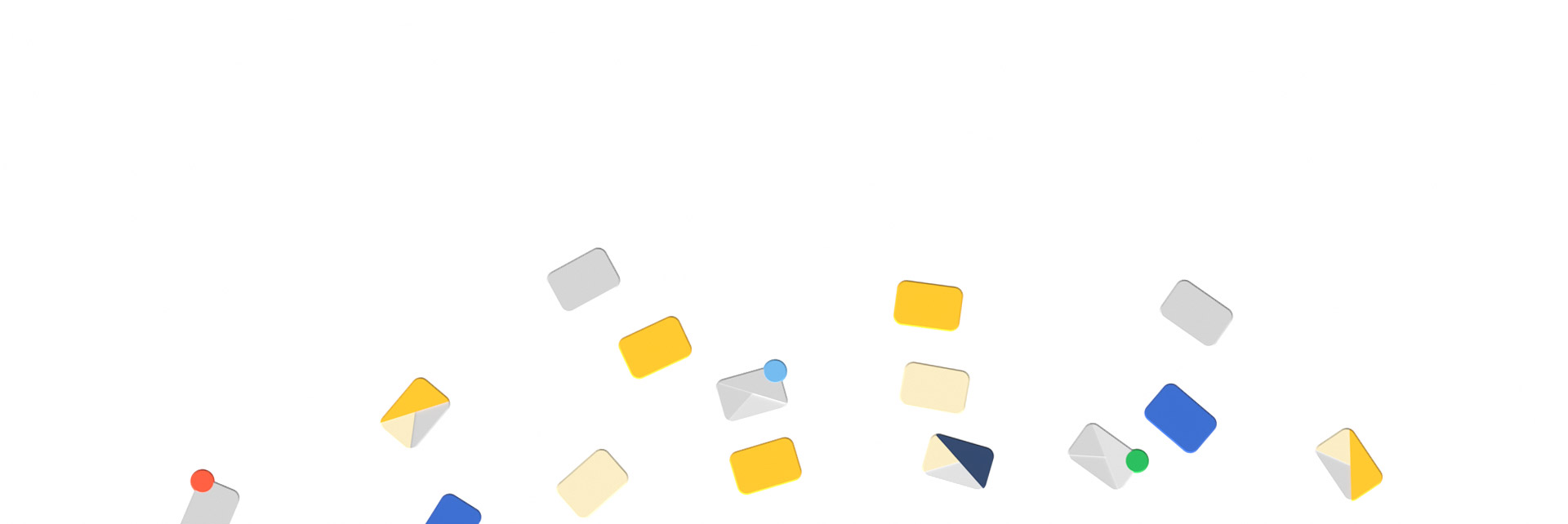
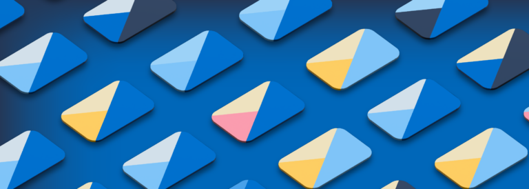
Our logo has two parts: the envelope and the circle. The envelope shows what we do, which is email. It should always be easy to find your email when scanning a full screen of apps. Our new envelope, going in a more geometric direction, resembles the logo for our group email product, Topicbox.
Through the circle, we show how we’re different from other providers. For us, it represents the circle of trust, protecting you and your email. You can rely on Fastmail for service and support, and trust that your personal information is protected. You come first, and you can bank on it.
We use illustrations in our new website design to show how Fastmail benefits the people who use it.
You’ll notice that our illustrated characters are not obsessed with their devices, but living in the moment. Or if they are on their devices, they are happy. Often they are making in-person connections.
Throughout our imagery, we wanted to show that Fastmail keeps customers connected, is useful and fast, and puts you in control.
Blue is often the color used for email, but we felt the former Fastmail blue could use a little perking up. Our new colors are a bit brighter, with warm accent colors evoking a positive spirit.
Our new font, Cresta, used in the logo and headings of the website, was designed by JTD Type Foundry and Design Studio in Philadelphia, where we have an office. Vibrant and stylish illustrations drove a contemporary look, and we loved working with our illustrator in New York, Amelia Chen.
Some things simply go out of style. We’re now using a lowercase "m" in Fastmail to match how we see our customers talk about us every day.
We hear it from you — using Fastmail is a choice that makes you feel good. Our new colors, design, and copy build on that emotion. While style is individual, time is important for everyone. We know email is a tool to help you live your life, not where you want to spend it. So we concentrated on being clear and straightforward so you can get to the point and carry on.
Still the same service you can trust, but with a fresh look, we hope everything we’ve released today reflects how you feel about Fastmail.
Upgrade your privacy and productivity and join the best in email.
Want more information? Visit our side-by-side comparison chart to learn more about why Fastmail is
a great alternative to Gmail.

Productivity is highly personal. Start using Morgen Assist and Fastmail together in under 5 minutes and begin smart scheduling in your calendar.
Today we are introducing new plans and pricing for new Fastmail customers, offering prices in many global currencies and launching some great deals to get your whole family on Fastmail.

Looking for a way to upgrade your inbox? Fastmail’s productivity features help you simplify your workflow and save time.